Pasta Amore

For Pasta Amore, I was given a brief to create a menu, table tent and brochure for an Italian restaurant. For these assets, I utilized Adobe InDesign. This program is technically appropriate for the project, as these are created for print. My work shows advanced knowledge of graphic design software, because it adheres to margins and layout. Encasing the design in a printable area, to ensure that none of the information is cut off unnecessarily.
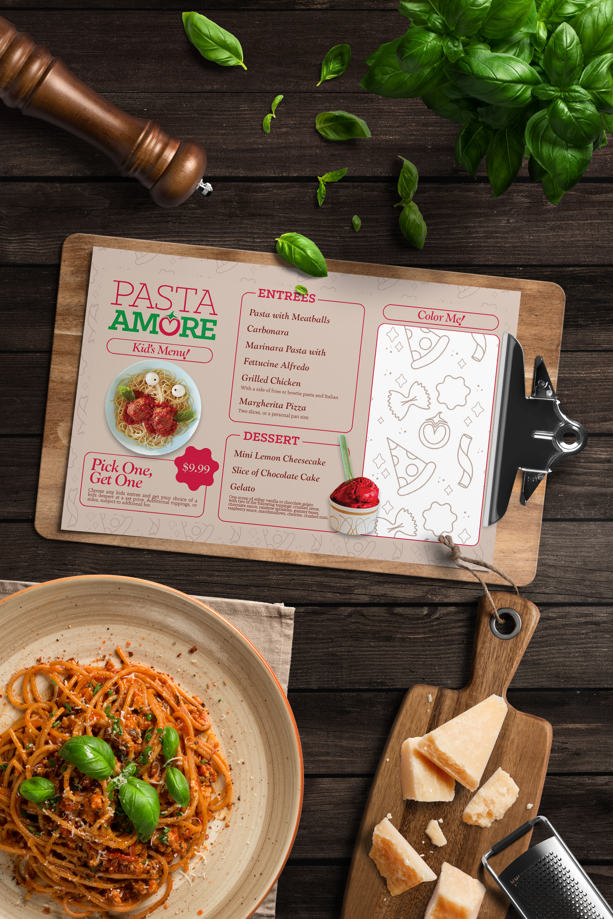
I employed multiple elements of design like lines and shapes, to direct the eye. I specifically chose images to draw in the eye and direct the viewer. The lines around each section hold all the information to ensure nothing is lost. I utilized just a few main colors from the style guide – the beige color as the background to everything, and the darker wine, green and red for the text and elements as they stood out the most. This created contrast so that nothing would be unreadable. I utilized repetition with each section to ensure that design was cohesive throughout, matching the design from the menu to the table tent and the brochure. I think this creates a rhythm for the piece, so that all work together in unity.
As always with designs, I create a mood board of the vibe I want to go for. I looked at more fun modern menus for inspiration and at what competitive Italian Restaurants were creating for their branding to compare. I began mind-mapping what I wanted on each asset and sketched my initial idea for a menu. Everything else grew from there. I wanted to emphasize the fun & fresh part of Pasta Amore’s vision statement, and I think I did that through image choices, the creation of a fun unique pattern. I believe this also shows originality, as it’s clear I worked hard to capture the ethos of Pasta Amore in the work. There is evidence of application and ethical guidelines, as the message in the design is clear, nothing can be misconstrued.
Originally, I followed a design brief given for the creation of each Pasta Amore asset, I worked on this during my time at SNHU, which means I worked on the pieces as I received critique from my professor and fellow classmates. Refining was much the same, some of the critique I was given was to bold the prices and to add a drop shadow to the images. I did follow this and found that it added a little extra something to my design that was lacking before. The images now pop off the page. The only piece of critique I didn’t take was to add a white background to each of the menu sections. When I did this, it looked very out of place and didn’t match the original design brief at all. In a bid to keep with that, I decided to keep with the original background color.
All the assets here were created in InDesign and saved as AI files and PDFs with cut lines present so that no part of the design would have to be compromised. PDF is a high-quality print format, that suits a menu, brochure and table tent well. This retains full quality and color. They also show clear understanding of grid and format, as everything is very uniform throughout with specific columns and margins. For my portfolio, I am presenting them as mockups or how they may be presented whilst in the restaurant or at home. Colors and typography were pulled right from the style guide that came with the project design brief, so everything is catered specifically to Pasta Amore. This is crucial for potential clients to see how the pieces would look in practical settings.
Please find the other assets below, which can be enlarged by clicking.